Chamrousse: Tourism Office remade!
Problem
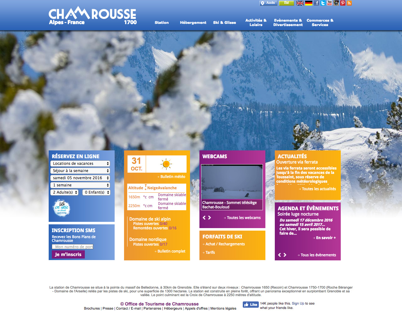
Chamrousse Tourism Office website dates back to 2010. Its convoluted information architecture has made the access to alerts, promotional offers, facility information and activity plans lost in an enigmatic navigation. Content was scattered all around the site. 💆🏽♀️💆🏻♂️
Study
My team and I started with a content audit and classified the types of information. I studied the details on each page and clustered their target features and services. We discerned all together scenarios & entry points to the website and analysed visitors’ online journey. I carried out a benchmark with my teammates to compare competitors’ market position and to sharpen Chamrousse's ✨ strategic selling points.
Hands-on
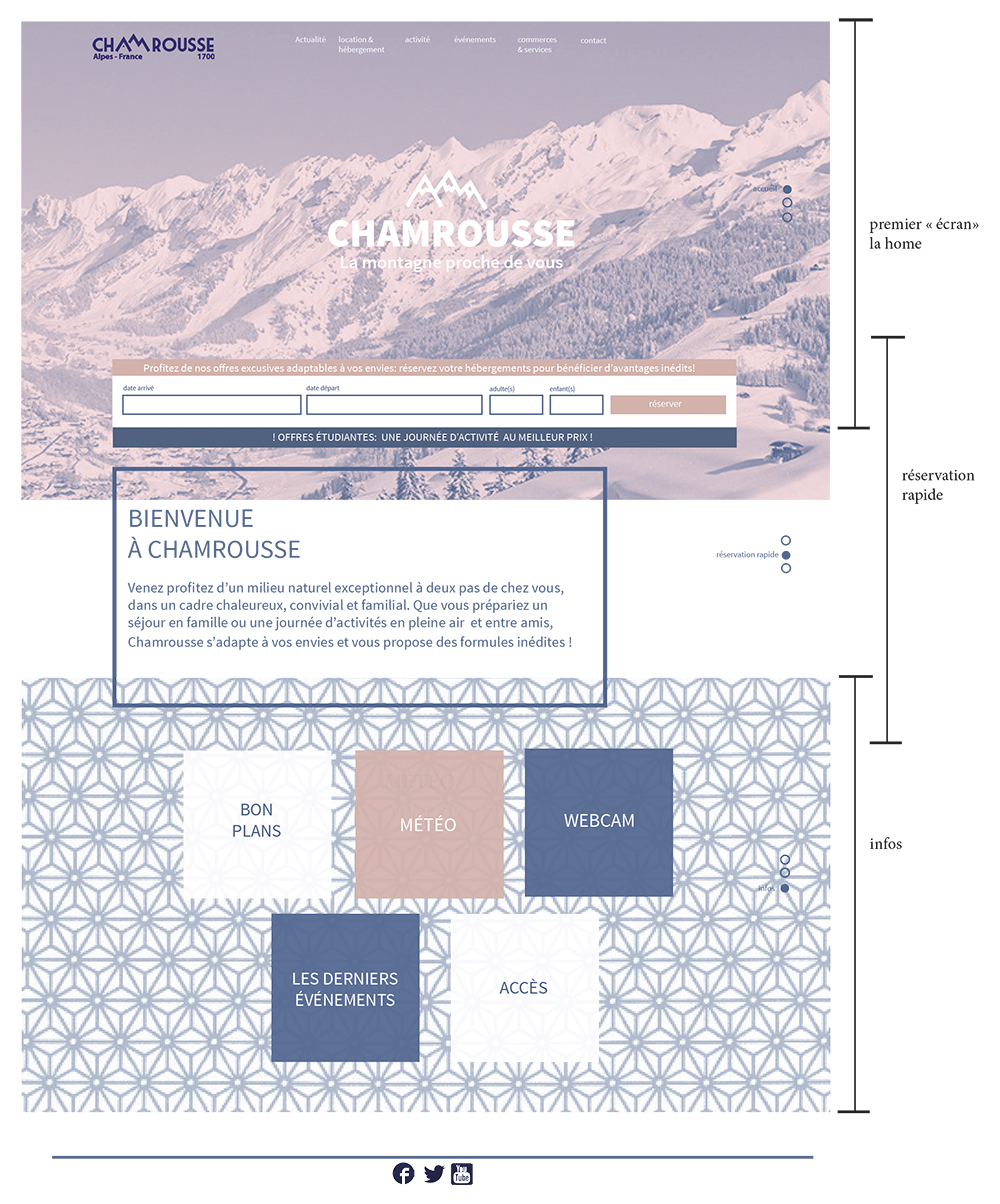
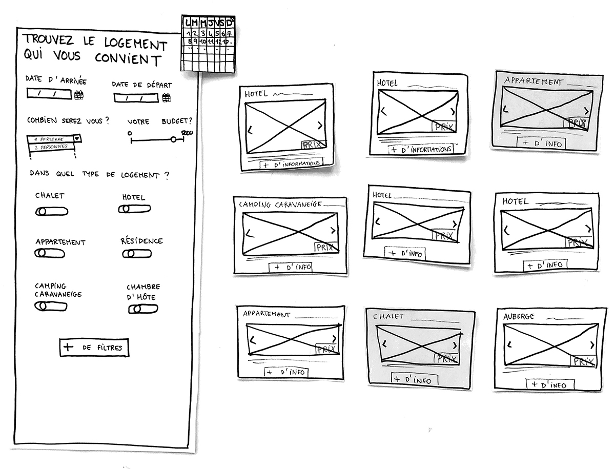
With regard to the identified use cases, we applied card sorting to re-shuffle the architecture and gradually standardised navigation paths. We produced quick and dirty paper mock-ups for testing our 🔀 user flow. We iterated our design according to testers’ feedback. We put ski resort visitors’ concern to our highest priority, but also retained a seasonal touch for summer activities.
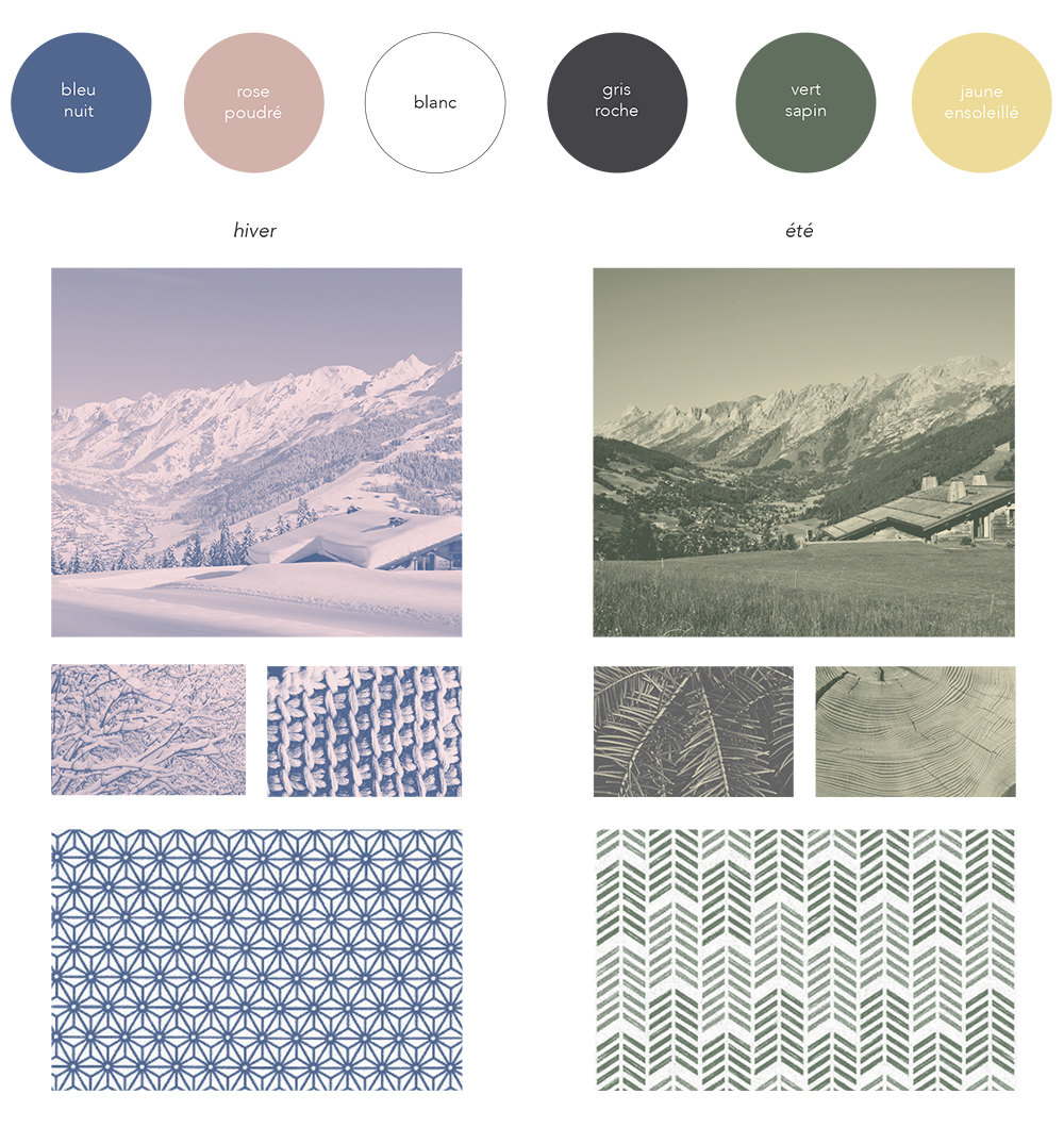
At the same time, our graphic designers refreshed Chamrousse Tourism Office’s visual identity and aligned it across the online interfaces we produced. This gave a fresh, energetic yet calming look. 😄
We created wireframes & visual mock-ups for the new website, together with a analytical report on our design process and recommendations for their content management.